Responsible Responsive Images
By Lenny Peters
Images in responsive design have been a hard thing to implement since serving assets to users to websites since the invention of media queries. A lot of websites made it to market recently with responsive designs that work in multiple aspect ratios but the cost on mobile users have been astounding.
Responsive images should not only be served with the devices in use being designed for but also the limitations of data that is in mobile device plans. The cost of images on the web is astounding when it gets totaled up.

Part of the understanding on how images should be served understands that the Internet is meant for everyone. Yep that’s correct. Not certain people with certain devices but everyone and everything. And the implementation of progressive enhancement is how we build web sites responsibly. Responsive images should be responsible as well.
So now you might ask how to we achieve this? Upon doing some research and seeing many different techniques I believe seeing a few examples on serving the appropriate sized assets for viewport sizes helps keep the bandwidth lean and “responsive” as in fast.
Enter picturefill.js from the responsiveimages.org site. Upon the horizon in all of the browsers a new element will be placed into work to help the pain of super sized network calls for shiny huge responsive images. Well actually a few solutions already floating out on the web. The first is called the <picture> tag. Its purpose is to be a containing element to wrap images in to load several <source> tags on where to get images from based on media queries being defined. The other is the srcset attribute for the <img> tag and it works in the similar fashion.
Currently both are in stages of development but I am happy to say support for these techniques are in use already.
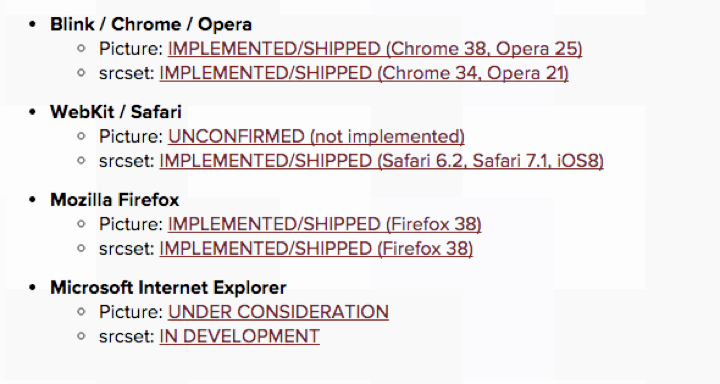
As you can see the <picture> tag is already being used by Chrome and Firefox and with picturefill.js we can cover all of the other browsers with it. The scrset attribute is the most covered with most of the modern browsers out there, we will be seeing support across all of the browsers soon.
Having an solution of implementing one image to be uploaded that made multiple crops might be tedious to some. But the advantage of loading only the asset needed to users would be overwhelming positive from a users perspective.
Demo
Examples
- https://ericportis.com/etc/smashing-mag-picture-examples/variable-size.html
- http://alistapart.com/d/407/demo/status-quo.html